How to Design Restaurant Flyers That Actually Get Read
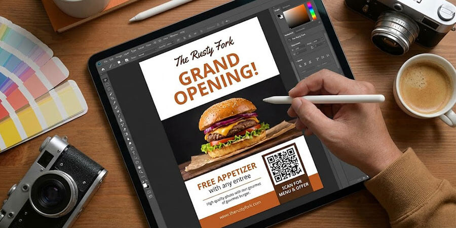
Table of Contents
How to create print materials that survive the 3-second trash-or-keep decision and bring customers through your door
Most restaurant flyers fail before anyone reads a single word - the design kills them in the first three seconds. This post breaks down the practical, visual decisions that separate flyers that get kept from flyers that go straight in the recycling bin. From layout anatomy to typography rules to food photography basics, you'll find concrete guidance a non-designer can actually use.
A flyer lands in someone's hands and gets about three seconds before they decide: keep or toss. That's not a distribution problem - it's a design problem. The flyer didn't earn the next three seconds.
Print still works. According to Lob's State of Direct Mail: Consumer Insights report, 84% of consumers read direct mail immediately or the same day they receive it. BIA Advisory Services projected 9.5% growth in restaurant local advertising spend for 2025. The channel isn't dying. But a poorly designed flyer wastes every dollar you put into printing and distribution.
If you want the full picture on print marketing - paper types, distribution methods, EDDM, and how flyers fit into a broader print strategy - the printed promotional materials guide covers all of it. This post focuses on one thing: making the flyer itself worth keeping.
Start With One Clear Message
The most common restaurant flyer mistake happens before anyone opens a design tool. The operator tries to say everything at once.
Full menu. Hours. The owner's story. Directions. Instagram handle. Phone number. Website. Catering info. Daily specials. The result is a flyer that communicates nothing, because nothing stands out.
Every effective flyer starts with a single question: what is the one thing I want someone to do after reading this?
- Come in for the new lunch special
- Bring this coupon for a free appetizer
- Show up to the grand opening on Saturday
- Scan this code to see the weekend menu
Pick one. Everything else on the flyer - the visuals, the supporting copy, the contact info - exists to support that single action. If a piece of information doesn't help the reader take that action, it probably doesn't belong on the flyer.
This isn't about being minimalist for its own sake. It's about respecting the three-second window you have. A reader's eye needs somewhere to land. Give it one clear destination.
The Anatomy of a Restaurant Flyer
Think of a flyer as four distinct zones. Each zone has a job. When one zone fails, the whole flyer suffers.
| Zone: | Purpose: | What to Include: | Common Mistakes: |
| Headline Zone (top 1/3) | Stop the reader, communicate the core offer instantly | Bold headline, subhead if needed, restaurant name | Too many words, weak headline, burying the offer |
| Visual Zone (center) | Create appetite and emotional pull | High-quality food photo or strong graphic | Low-res images, cluttered visuals, no focal point |
| Offer Zone | Give the reader a reason to act | The specific deal, event, or hook | Vague offers ("great food!"), no expiration date |
| Action Zone | Tell the reader exactly what to do next | CTA, QR code, phone number, address | Missing CTA, too many options, QR code too small |
| Contact/Info Zone (bottom) | Remove friction for follow-through | Hours, address, website, social handle | Missing hours, wrong address, no website |
The headline zone and visual zone do the heavy lifting in that first three-second window. If those two zones don't work together, the reader never reaches the offer or the action.
A useful gut-check: hold the flyer at arm's length and squint. Can you still read the headline? Does the visual draw your eye? If not, something needs to change before you print 500 copies.
Typography and Readability
Restaurant operators aren't graphic designers, and that's fine. But typography has a few hard rules that make the difference between readable and unreadable.
Font size minimums. Body text should be at least 10-12pt. Headlines should be 24pt or larger. If you're designing for a half-sheet (5.5" x 8.5"), go bigger - smaller formats need larger type, not smaller.
Limit yourself to two fonts. One for headlines, one for body text. More than two and the flyer starts to look chaotic. Pair a bold, attention-grabbing headline font with a clean, readable body font.
Contrast is non-negotiable. Dark text on a light background, or light text on a dark background. Never light text on a medium-toned background - it disappears. The most common readability failure on restaurant flyers is low contrast: cream text on a tan background, dark green text on a forest green photo.
Avoid decorative fonts for body copy. Script fonts and display fonts can work for a headline or a restaurant name. They're nearly unreadable at small sizes in paragraph text.
Hierarchy matters. The reader's eye should move naturally from the most important element to the next most important. Use size, weight, and spacing to create that path. If everything is the same size, nothing is important.
Canada Post's neuromarketing research (conducted by True Impact Marketing) found that direct mail takes 21% less cognitive effort to process than digital media and produces 70% higher brand recall. That advantage disappears if the typography makes the reader work to decode the content.
Food Photography and Color
A great food photo on a flyer does something no headline can: it triggers appetite before the reader consciously processes anything. A bad food photo does the opposite - it makes the food look unappetizing and undermines the whole message.
Resolution is the baseline. Print requires 300 DPI (dots per inch) minimum. Images that look fine on a phone screen will print blurry and pixelated. If you're pulling images from your website or social media, check the resolution before using them in print.
Phone photos can work - with the right lighting. Natural light near a window, or a simple ring light, can produce print-quality food photos. The key is avoiding harsh overhead lighting, dark shadows, and cluttered backgrounds. A clean surface, good light, and a tight crop go a long way.
Warm colors increase appetite. Color psychology research has consistently shown that warm color tones - reds, oranges, and yellows - are associated with increased appetite and a sense of urgency in food contexts. It's why virtually every major restaurant chain uses these palettes in their signage and marketing materials. It's not arbitrary - it's one of the most replicated findings in food marketing research.
Brand color consistency matters more than you think. If your restaurant has established colors - on your signage, your menu, your website - use them on your flyers. Consistency builds recognition. A customer who's seen your red-and-black branding on your A-frame sign boards out front will recognize the same palette on a flyer in their mailbox.
One strong visual beats a collage. Resist the urge to show six dishes at once. Pick the one that photographs best and represents the offer. A single compelling image has more impact than a grid of smaller ones.
The Call to Action That Drives Response
The CTA is where most restaurant flyers quietly fail. The design looks decent, the food photo is solid, and then the flyer ends with something like "Visit us today!" That's not a call to action. That's a suggestion.
According to Lob's State of Direct Mail: Consumer Insights (2023), 62% of consumers say direct mail inspired them to take action - and 64% of those said it was because of a specific offer or promotion. The offer is the engine. The CTA is the ignition.
Make the offer specific and time-bound. "Free dessert with any entree - valid through March 31" outperforms "Come try our desserts" every time. An expiration date creates urgency. Without one, there's no reason to act now rather than later (and later usually means never).
Use a QR code. A QR code on a flyer bridges the gap between print and digital - it lets a curious reader go straight to your menu, your reservation page, or a landing page with the offer details. That bridge matters because the easier you make it for someone to take the next step, the more likely they are to take it. Make the QR code large enough to scan easily (at least 1" x 1" on a standard flyer).
Make the CTA visually dominant. The offer and the action step should be the second thing the reader's eye lands on, right after the headline. Use a contrasting color, a box, or a bold font to make it stand out from the surrounding content.
For more on structuring offers that drive response, the coupons and promotions guide goes deep on offer mechanics, redemption tracking, and what types of promotions work best for different restaurant formats.
Common Restaurant Flyer Mistakes
These are the design failures that send flyers straight to the recycling bin. Most are fixable before you print.
Too much text. If your flyer has more than 75-100 words of body copy, cut it. Readers don't read flyers - they scan them. Every sentence that isn't essential is a sentence that dilutes the message.
No clear offer. "Best pizza in town" is not an offer. "Buy one pizza, get one free this weekend" is an offer. Vague claims don't give readers a reason to act.
Low-quality images. A blurry or poorly lit food photo actively hurts your brand. If you don't have a good photo, use a strong graphic or a clean color block instead. A bad photo is worse than no photo.
Missing contact information. Hours, address, phone number, and website should be on every flyer. Missing any of these creates friction that kills conversions. A reader who wants to visit but can't find your hours will move on.
Inconsistent branding. If your flyer looks nothing like your restaurant's other materials, it creates confusion. Consistent colors, fonts, and logo usage build recognition over time.
No QR code. In 2024, nearly 3 billion EDDM pieces were sent according to U.S. Postal Service Postal Facts data - and QR codes have become a standard bridge between print and digital. Leaving one off is a missed opportunity.
Font too small to read. If someone has to squint, they won't. Check your flyer at actual print size before finalizing.
Pairing a well-designed flyer with other local touchpoints - like A-frame sign boards outside your location - reinforces the same message across multiple points of contact. Repetition builds recall.
For a broader look at how to advertise your restaurant across channels, or strategies focused on attracting new customers to a new or growing location, those posts cover the wider picture. And if you're thinking creatively about where and how to distribute flyers, the guerilla marketing tactics guide has unconventional approaches worth considering.
For campaign-level strategy - how flyers fit into a seasonal promotion, how to coordinate print with digital, how to measure results - the offline marketing guide is the right resource.
Frequently Asked Questions
How do I design a restaurant flyer if I have no design experience?
Start with a template from any online design tool, but customize it heavily - most templates look generic out of the box. Focus on the fundamentals: one clear message, a strong headline, a high-quality food photo, and a specific offer with an expiration date. Keep the layout simple. Two fonts, high contrast, and plenty of white space will get you further than a complicated design.
What should be on a restaurant flyer?
Every restaurant flyer needs five things: a headline that communicates the core offer, a strong visual (food photo or graphic), the specific offer or reason to visit, a clear call to action (including a QR code), and your contact information - address, hours, phone number, and website. Everything else is optional.
What's the best size for a restaurant flyer?
The most common sizes are 8.5" x 11" (standard letter), 5.5" x 8.5" (half-sheet), and 4" x 6" (postcard). Half-sheets are a good default - large enough to include all the key elements, small enough to feel manageable. For EDDM mailings, postcard formats are popular because they don't require envelopes and the offer is immediately visible.
Do restaurant flyers still work?
Yes. Lob's research shows 84% of consumers read direct mail the same day they receive it, and 82% of businesses increased their direct mail spend in 2024 - up from 58% the year before. The channel works when the design and offer are strong. Flyers that fail usually fail because of weak design or a vague offer, not because print is ineffective.
What makes a restaurant flyer stand out?
Three things: a specific, time-bound offer (not just "come visit us"), a high-quality food photo that triggers appetite, and a layout where the headline and offer are immediately visible without any effort from the reader. Most flyers fail on at least one of these. Nail all three and you're ahead of the majority of what's in people's mailboxes.
How much text should a restaurant flyer have?
As little as possible. Aim for under 100 words of body copy. The headline, offer, and call to action should do most of the work. Supporting details - hours, address, website - can live in a smaller info block at the bottom. If you find yourself writing paragraphs, cut until you can't cut anymore.
Should I put a QR code on my restaurant flyer?
Yes. A QR code lets interested readers go directly to your menu, reservation page, or a landing page with the offer - without having to type a URL. Make it at least 1" x 1" so it's easy to scan, and test it before printing. Link it to something specific and relevant to the offer on the flyer, not just your homepage.
Related Resources
- Restaurant Printed Promotional Materials Guide - Complete guide to print marketing for restaurants: paper types, EDDM, distribution, and more
- Restaurant Offline Marketing Guide - Campaign-level strategy for coordinating print, events, and local advertising
- Restaurant Coupons and Promotions Guide - How to structure offers, track redemptions, and run promotions that drive real revenue
- How to Advertise Your Restaurant - Advertising channel overview for restaurant operators on any budget
- Restaurant Guerilla Marketing Guide - Creative, low-cost tactics for getting your message in front of local customers
Share This!